Grid Layout
The CSS Grid Layout Module offers a grid-based layout system, with rows and columns, making it easier to design web pages without having to use floats and positioning.
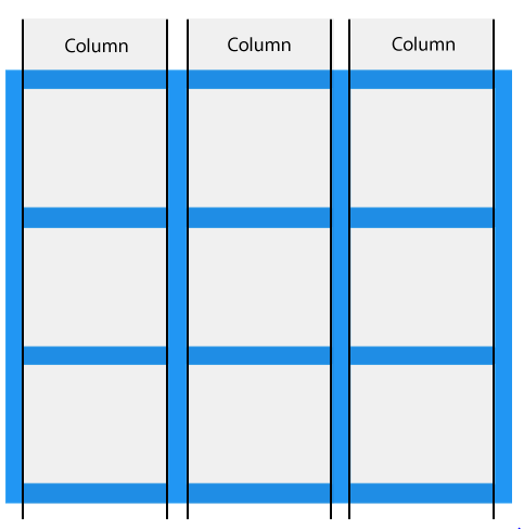
Grid Columns
The vertical lines of grid items are called columns.
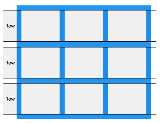
Grid Rows
The horizontal lines of grid items are called rows.
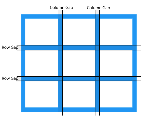
Grid Gaps
The spaces between each column/row are called gaps.
Grid Lines
The lines between columns are called column lines.
The lines between rows are called row lines.
The grid-template-columns Property
The grid-template-columns property defines the number of columns in your grid layout, and it can define the width of each column.
The grid-template-rows Property
The grid-template-rows property defines the height of each row.